
 +91-984-5825982 | +91-996-4689921
 sales@cumulations.com
 Send your requirement
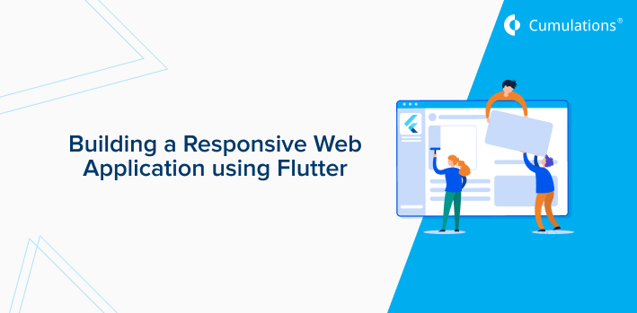
Have you heard of the emerging framework named Flutter? Well, Flutter is perhaps one of the trending app development frameworks in the market these days. An open-source web framework created by Google, Flutter has taken the internet world by storm due to its endless benefits. Flutter framework has several benefits and one of the major benefits include its responsiveness.
It is quite easy to implement and is platform-independent as well. In this article, we will dive deep into the procedure of creating a responsive web application using Flutter. We will see how to build a Flutter web application that will respond to layout and screen size changes.
Responsive Designing using Flutter
You might ask what is the meaning of this term ‘responsive design’. Well, it is not that complicated as it sounds. Responsive design is the responsiveness of web and mobile applications to certain layout changes.
The mobile platforms such as Android and iOS have brought up the concept of universal layouts and therefore have tackled the issue. The Flutter app developers have used constraints and automatic resizing elements to optimize and improve the responsiveness of the Flutter apps.
Reasons for building a responsive web application
There are certain reasons why the developers need to build a responsive web application using Flutter. The major ones are listed below for your convenience:
Different device types and screen sizes
Flutter applications can be run on devices such as smartphones, television screens, and even smartwatches. Each device mentioned above has different screen sizes and run on different operating systems.
An app will function differently in each device if not tweaked and optimized properly. This is one of the major reasons the developers need to make a responsive web application using Flutter to make it compatible on all devices.
Keyboard state changes
Every device comes with an inbuilt keyboard these days and these keyboards are mostly provided by the manufacturers of the devices. Also, you can download popular keyboards and use them on your smartphones and tablets.
The problem with the various keyboards is that their layout changes as soon as you start interacting with the text fields. These layout changes can hamper your experience if not tweaked properly. To handle the keyboard state changes, the developers need to have a look at the responsiveness of the web application.
Orientation changes
Screen rotation is a feature used by mobile and tablet users frequently and well this can be a problem for the responsiveness of a web application. The web application needs to be responsive enough to adjust to the screen rotation. The developers need to tweak this or else it will negatively affect the user experience.
The basic requirements
In order to create a responsive web application using Flutter, the flutter developers need to accumulate a certain set of software tools, to begin with. Here are the set of tools which are required in the process:
Flutter software development kit.
The Chrome browser for debugging purposes.
An Integrated development environment that supports Flutter.
Also, the developers can install Flutter inspections such as Visual Studio Code, Android Studio, and Intellij IDEA and install all Flutter and Dart plugins. This will enable language support and all the required tools for debugging and editing.
Flutter elements we need to work with
There are certain key elements we need to know before actually stepping in the development phase of the Flutter web application. They are as follows:
Orientation
We need to know the type of layouts available in the devices and also be able to determine the layout based on the devices. There are two possible layout values – Landscape and Portrait.
Device Screen Type
We need to determine the device screen type our content is getting displayed on. The device screen type includes the mobile screen, the tablet screen, the computer screen, and others.
Screen Size
Determining the total screen size is essential for the building phase of an app. Without knowing the available screen sizes, it will be difficult for the developers to build a responsive web application using Flutter.
Local Widget Size
This allows the users and developers to make a smart UI choice at the Flutter widget level.
Building a responsive web application using Flutter
The flutter app development moment is here. We now know why it is important to build a responsive web application using Flutter. But the question arises from where to start and how to do it? Well, there is nothing to worry about as we have got you covered up. Below we will discuss the elements which are responsible for the responsiveness of a Flutter web application.
Use MediaQuery for layout
An important element in the Flutter framework, the MediaQuery can be used to determine the layout of the application. This option is very beneficial when it comes to optimizing the layout changes. You can make it responsive based on the two types of layouts – landscape and portrait.
Using widgets – LayoutBuilder and OrientationBuilder
You can use LayoutBuilder and OrientationBuilder as alternatives to the traditional MediaQuery to tweak the layout changes. Various widgets can malfunction if not optimized properly. Using the above two options, you can solve the widget problem and run applications on various layouts and screen sizes.
The FittedBox
The Flutter widget FitteBox is an essential component for auto-resizing text based on the parent widget size. It can be difficult for users to increase the font size randomly as it can go over the box. The FittedBox widget will allow scaling according to the parent widget size.
Fix the broken gallery
There can be layout and screen orientation problems if the aspect ratio is not taken care of. Now, what is this aspect ratio? The aspect ratio is the ratio between the height and the width of the box. The AspectRatio widget option will allow the widget to resize itself freely according to the screen orientation. It will be different in the landscape and portrait modes.
The Custom Multi Child Layout widget
Flutter comes up with a facility known as CustomMultiChildLayout widget which allows the layout widgets to formulate on it’s own depending on the type of layouts. The usage of this widget is to allow the user to layout the children to be passed to this widget in a single function. The positions and sizes can be dependent on each other.
Declarative UI
The frameworks starting from Android to iOS generally use an imperative style of UI programming. This is the most commonly used UI programming and the developers can manually build a fully operational UI entity.
Must read: 17 Flutter Apps you never know existed
The traditional UI programming puts a lot of burden on the developers and to ease the burden, Flutter has come up with Declarative UI. This lets the developers declare the current UI state and leaves the entire transitioning process to the framework.
Final Takeaway
Ready for the tweaks in your web application? Well, it is not a difficult task at all to build a Flutter web application. The challenge arises when the web app developers need to make it responsive across all platforms.
That is nothing to be worried about as we have covered the key elements which can help you in making your web application responsive across all available platforms. Make sure you adhere to the above-mentioned steps and all the best!
Related read: Best Technology Stacks for Web Application Development
